How To Choose The Perfect Call-to-Action for Your Website
In the digital marketing landscape, the call-to-action (CTA) on your website is not just a button or a line of text; it’s the critical juncture where your site’s visitors decide to dive deeper into your business offerings or drift away. Your CTA is probably the single most important element on your entire website.
We are a marketing, advertising, and branding firm for the maritime industry. Our services are designed to help mission-driven businesses clarify positioning, expand reach, and increase revenues. Request a Free Strategy Call or just shoot me an email at mcharette@boatsquarterly.com
Understanding the Power of CTA
Imagine a scenario where a thousand people visit your website. Statistically, about 99% of these visitors leave without engaging, representing a significant loss of potential leads. This is where a compelling CTA can make a monumental difference. A well-crafted CTA can transform your site’s performance, converting a higher percentage of visitors into leads or customers.
The Anatomy of an Effective CTA
- High Perceived Value: Your CTA should offer something irresistible. It should promise a reward that your audience finds valuable. For instance, a free consultation or a comprehensive guide can be more enticing than a generic newsletter sign-up.
- Low Perceived Risk: Alongside high value, your CTA should minimize perceived risk. This can be achieved by offering something free or at a low commitment, like a no-obligation quote or a free trial. The lower the perceived risk and the higher the perceived value, the better your conversion rates will be.
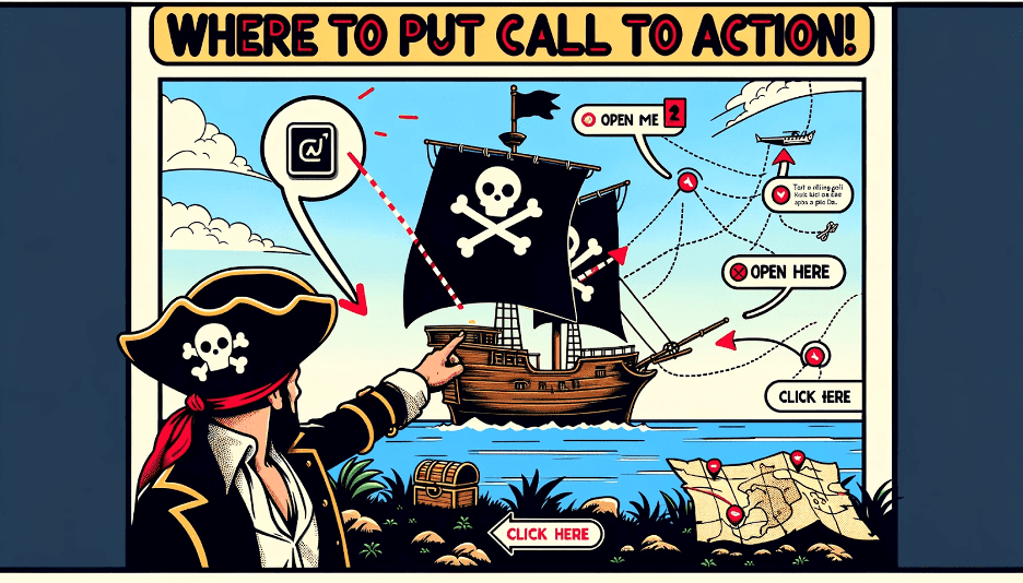
- Strategic Placement: Don’t bury your CTA at the bottom of the page. It should be prominently placed where visitors expect to see it, much like the ‘Buy’ button on an Amazon product page.
- Relevance to the Sales Process: Your CTA should be a natural step in the buyer’s journey, not an unrelated action like subscribing to a newsletter. It should pave the way for a potential sale or lead.
Designing Your Perfect CTA
The process begins with understanding your customer’s journey. Identify where your customers are now and what their end goal is. Your CTA should help them move along this journey, addressing their immediate needs and concerns. For example, if the blockage is price uncertainty, your CTA could offer a free quote or consultation to discuss pricing.
Real-World Examples and Their Impact
Consider the difference between a low perceived value CTA, like a simple contact form, and a high-value offer, such as a free, detailed consultation. The latter is more likely to yield a higher conversion rate. What we’re expecting people to do here is to say, ‘Oh yeah, this business is qualified for us. I’ve seen enough that I really want to work with them.’
The Psychological Edge
Your CTA should not only be a functional part of your website but also a psychological trigger that nudges the visitor towards making a decision. It should create a sense of urgency or offer a solution to a problem they are facing. By aligning your CTA with the visitor’s mindset and needs, you increase the likelihood of them taking the desired action.
Conclusion
The perfect CTA for your website is more than just a button; it’s a strategic tool that can significantly increase your conversion rates. By ensuring high perceived value, low perceived risk, strategic placement, and relevance to the sales process, you can create a CTA that not only resonates with your audience but also drives them towards taking action.
Start off by drawing where your customer is now and where they need to be. Figure out what you can give them along the way and then figure out what their objections from doing business with you right now are going to be, and make sure that those are answered by your call to action.
MIDA.PRO – Marine Industry Digital Agency – Web dev / Marketing
Podcast – SHIPSHAPE INTERNATIONAL OCEAN INSIGHT
